Blog

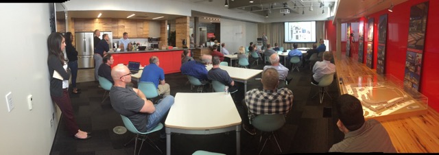
You spoke, we listened!


You spoke. We Listened.
If you aren’t launching a second version of your product after a feedback session, what are you doing?  After our preliminary presentation, Michael and I will take a short rest and review all the information and questions conveyed about our project.  How can we make it better?  What research opportunities could we discover?
The question we asked, is what is it doing well right now and would could it do in the future?
 
New Research Opportunities
Communication and Access to Data
Data available for teaching/learning
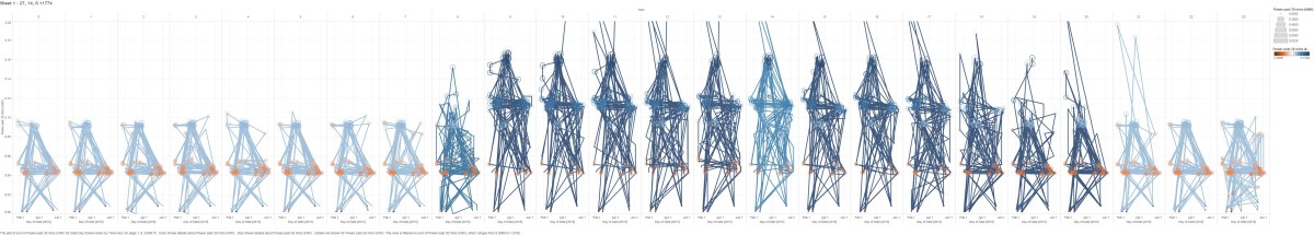
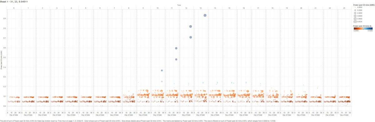
Integration to new forms of data
 
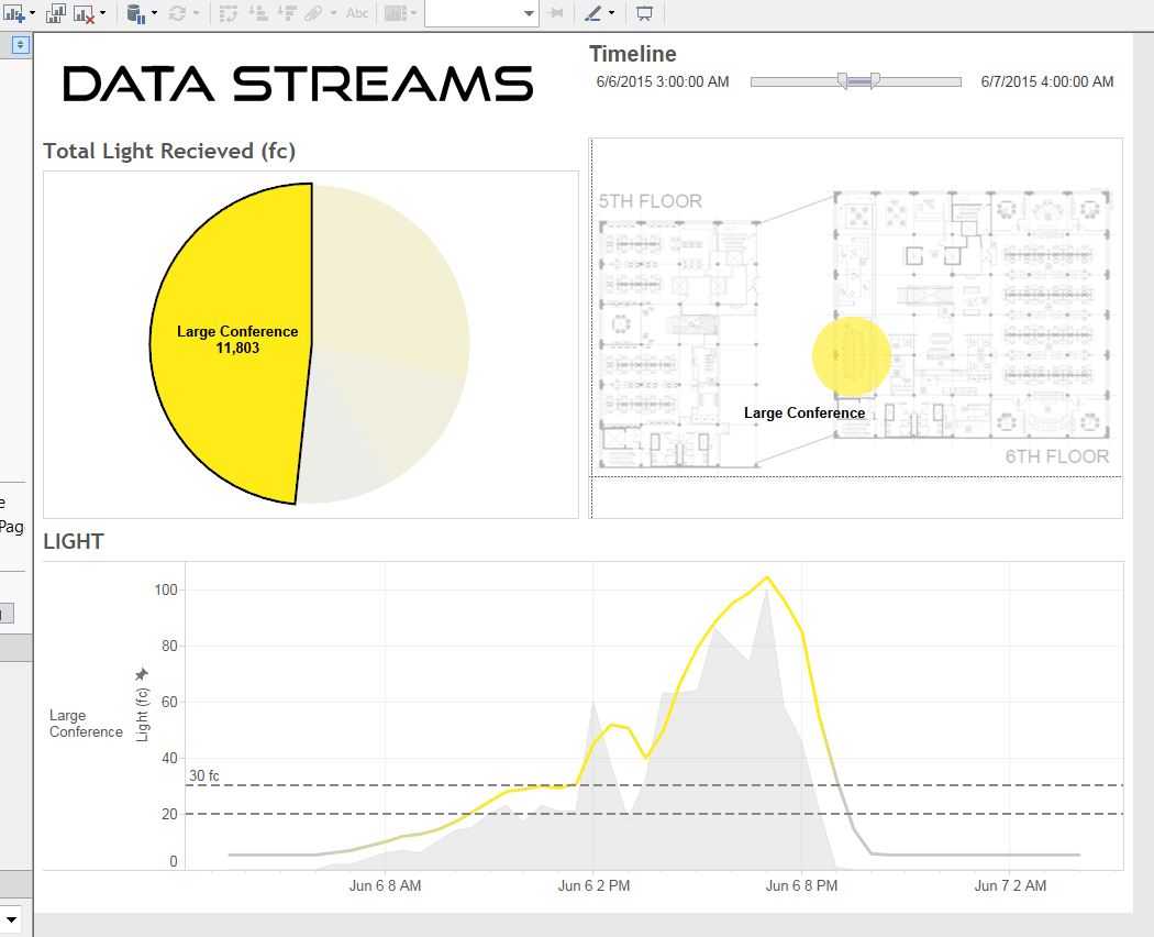
Data Streams 2.0, now with more data!
 .
IMG_0852

Building Data Dashboards

Using our data that’s stored in the cloud and linking it into Tableau, we’re able to create interactive dashboards for our sensors. As you can see we’re able to gauge things like total light received, relative light in relation to office areas, and light over the course of a day.

The rest of the dashboards should be completed this week and hopefully will be test embedded in the website next week.

Final Countdown

Or is it the final count-up? We tend to think of things with time associated with them.

i.e. Let the countdown begin. There’s a deadline we need to meet. Its almost time for Christmas.

What we’re proposing is a way to “count back” to where you were, to help predict where you’ll be later.  This is completely disruptive to the time scale way of thinking.  If I needed to know travel paths for guest for a particular high school, during a specific type of event, how would I do that?  I would need data from the past to help me get close to predicting the future.

Data Streams is here for just that scenario.  We can visualize building data.  We can validate design options through proof of performance.  We test hypothesis with scenario creation.

Let’s think of another scenario.  I’m a school administrator and I need to get some budgetary numbers put together for next year’s electrical needs.  Yes, you could look at all the bills from the past decade and see what to expect.  You don’t need Data Streams for that.  What you do need it for is adjusting your electrical usage schedule to help optimize when the lights are on, and WHY they are on.  So often a classroom gets left on for hours upon hours without any student or staff use.  Data Streams collects that data and uses it to do a “self check” against multiple variables.  For instance, a classroom recorded very minimal acoustical info and cross referenced it with the motion detection sensors.  It finds that the room was not in use, but the lights were on.  Just for good measure it discovered with its lighting sensors that it was very sunny those days.  It also found this was true for several days, over several months.  This could result in small savings during that time, and that was JUST one classroom.  It adds up.

Let’s take a look at my energy usage over the course of a day, starting at midnight.  You can see that by 8am, I’m just beginning to pull load from the outlet and continues throughout the day, usually past 7pm.  This <below> is the result of my data collecting on my workstation alone over the past 5 months.

Sheet 1

This is just one way to look at the visualization of this aggregate data.  It’s taken quite a bit of effort to scrub the data and get all the information reading correctly, but in the future, we hope to optimize and automate this process.  In fact, we’re almost there already.


This image below is the exact same data file.  But now I’ve isolated where I’ve had spikes in energy use (those blue dots way above all the orange ones).  I remembered that back in April, I did quite a bit of rendering on my computer.  Those were most likely the cause of the spikes.  So what you say?  Well by isolating that data I can get a more exact cost of what those renderings truly took to get done.  Now will we be nickel and diming our clients like this?  Probably not.  Its just there to show you the power of data and how it can be applied to real-world scenarios.

Sheet 2

Data Revolution

Data is an interesting topic lately.  Big Data, Small Data, just Data. Our designs are generating more information than ever before and we need a way to collect and visualize that information for our clients benefit.  Data is a fairly wicked problem as I see it, not only do we not know what data we should be collecting we don’t know how to efficiently collect it either.  We dream of tangible outcomes, new services, and proven designs from all this data. But how do we bring it all together?

The client owns the data, but we generate all of this information about the carpet selection, chair warranty, mechanical equipment, and electrical outlets among countless other items.  Then of course there is the data not being collected during the use of that design.  That is where I see Data Streams stepping in and really starting to bridge that gap between 3D and 4D.

It would appear DLR Group is at the forefront of this concept.  There are more and more articles and books being written about how to collect data, but little on the actual use of that data.  One recent article came from Architect Magazine.  You can view the short read from this link. http://www.architectmagazine.com/technology/how-big-data-is-transforming-architecture_o#|gigyaMobileDialog

Creating a backlog of information to pull from is critical in understanding how our buildings are performing.  Think of it as a new, easier way to perform a post-occupancy evaluation.  No forms, no meetings, just the evaluation and confirmation of how the building performs.  All from an acoustic, occupancy, energy and multitude of other data related forms.  Looking forward to see what DLR Group can do in the data-driven future.


Casey D. Kent

Data Visualizer

One of my favorite things about this project is finally seeing results that before, were merely thoughts and ideas.

Displayed below is an incomplete graph showing my personal power uses between part of the month of January (blue) and almost the entire month of February (tan).  By overlaying the two charts we can see where overlap occurred.  We can also see hills and valleys of my daily average kWh use.  Where there are zero readings are days that I had faults, so no data was recorded.  This shows that while that is unfortunate, it isn’t detrimental to the overall process if a day or two are not included in the graph.

Ultimately we will be using Tableau’s HTML plugin to read total output for not just my energy, but for acoustics, CO2, motion tracking and more!  This is just a test to see if we can perform the same task with alternative methods, like stock HTML code.  The next step is getting this to record and display our visualization live!

DataStreams Visualizer

Social Media

Stay up-to-date with our latest findings and progress