Data Collection
With our software now in place, we are collecting information on several sets of workstation energy-related data. To reiterate, after careful examination, Michael and I determined that collecting it every second or even every minute might be a bit excessive and not provide any relevant information that every 15 to 30 minutes couldn’t. Although our devices give a live feedback, we’re trying to determine whether that is as important as collecting and storing large amounts of data that is useful to a client over and extended period of time.
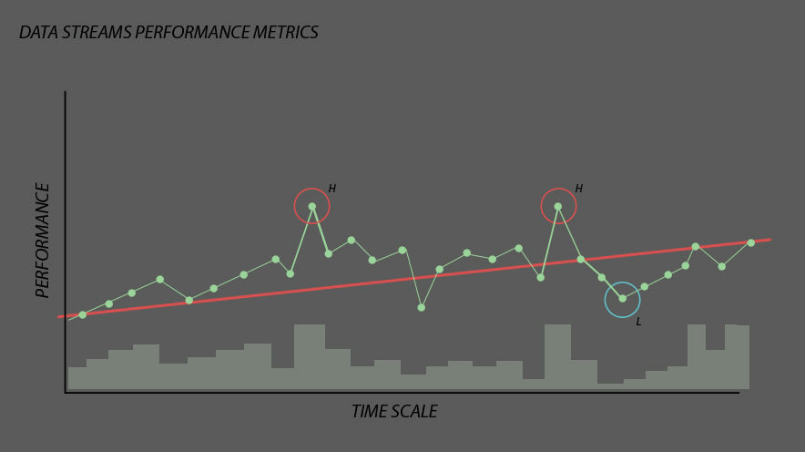
For example, would you tell a client that at any particular second such as 12:55:03 they used X amount of energy and at 12:55:06 they used the same amount? No! We imagine they are looking for big picture items. Energy spikes. Vampire loads. Load balancing. Have you ever imagined having a circuit panel that is smart? It would be something to help re-evaluate energy efficiency and reconstruct it to predict energy usage? The below graph represents twin energy spikes and also the monthly low. How can we design a system that avoids unwanted “H” spikes and maintains lower “L” points. This graph demonstrates that the building users are generating an overall upstream use of their energy. That is bad. Without Data Streams, this path could continue onward without reflecting the increased energy usage back to the occupants. Let’s try to grab those “H” levels and bring them down, helping to change the trajectory of our energy use graph.
I mentioned earlier that we have several sets of workstations (by employee) energy usages. Let’s start to examine the most curious one. Conference Room Guy. The conference room isn’t an employee of DLR Group, however he uses energy just like a person would. Conf. Room Guy has his own room, monitor (HDTV), laptop and controls. Let’s investigate what he uses when not in use versus when in use. Cue random numbers on excel spreadsheet.
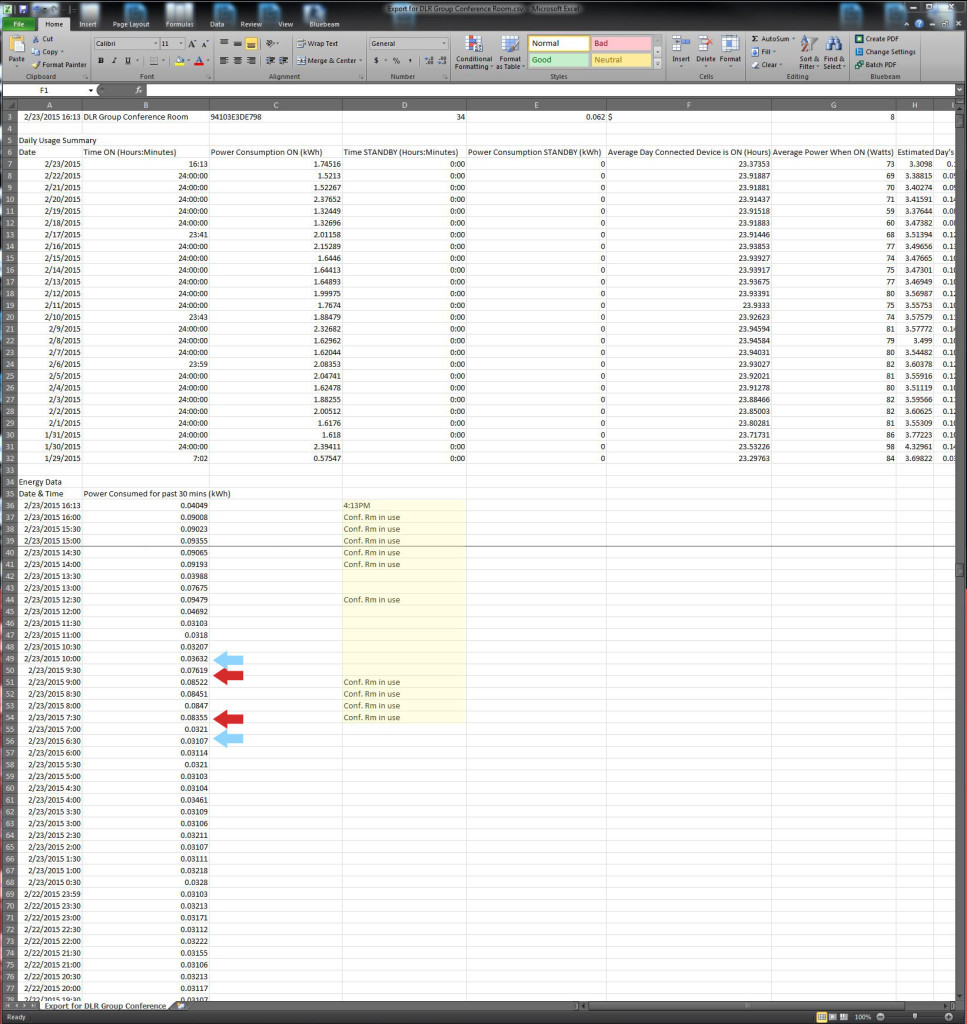
So I’ve taken the liberty to manually evaluate what all these numbers mean. I’ll have to admit this sooner or later, but my background is actually in engineering. Architectural Engineering class of ’01 with an emphasis in mechanical design. How I ended up a licensed architect is another story. So excel and five decimal digits is a familiar scene to me. Numbers are really the stars here. What do we see in Conference Room Guy’s stats that are easy picking? I’ve noticed that the energy use stats are three times higher for about 90 minutes at a time. What that tells me is that when the conference room is in use, we’re pulling nearly THREE times the wattage as when it is not in use. That is PLUG-LOAD levels ONLY. This data goes back as far as January and its easy to see when we use the conference room. So I know what each month uses for each workstation on a consistent hourly basis based on month.
Wouldn’t it be interesting to see if a computer could predict hour by hour usage based on 10 years of conference room guy experience? Yes, we’re trying to get there and the start of every great journey begins with the first step.
Today is that first step.