Data Visualizer
One of my favorite things about this project is finally seeing results that before, were merely thoughts and ideas.
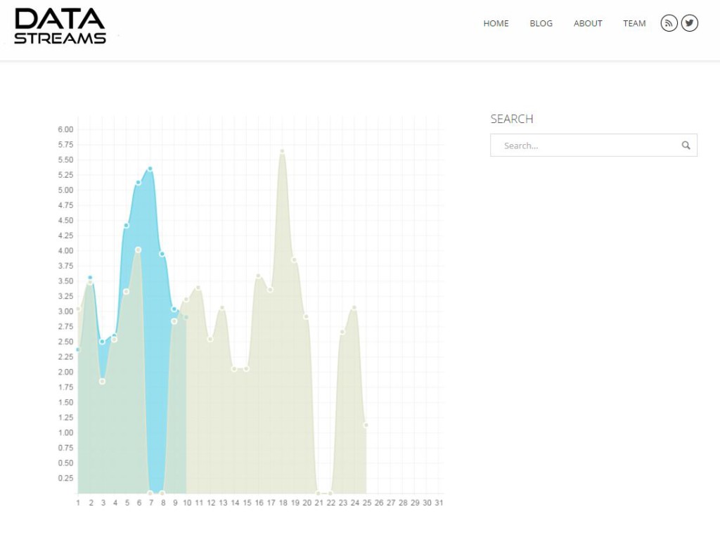
Displayed below is an incomplete graph showing my personal power uses between part of the month of January (blue) and almost the entire month of February (tan). By overlaying the two charts we can see where overlap occurred. We can also see hills and valleys of my daily average kWh use. Where there are zero readings are days that I had faults, so no data was recorded. This shows that while that is unfortunate, it isn’t detrimental to the overall process if a day or two are not included in the graph.
Ultimately we will be using Tableau’s HTML plugin to read total output for not just my energy, but for acoustics, CO2, motion tracking and more! This is just a test to see if we can perform the same task with alternative methods, like stock HTML code. The next step is getting this to record and display our visualization live!