Final Countdown
Or is it the final count-up? We tend to think of things with time associated with them.
i.e. Let the countdown begin. There’s a deadline we need to meet. Its almost time for Christmas.
What we’re proposing is a way to “count back” to where you were, to help predict where you’ll be later. This is completely disruptive to the time scale way of thinking. If I needed to know travel paths for guest for a particular high school, during a specific type of event, how would I do that? I would need data from the past to help me get close to predicting the future.
Data Streams is here for just that scenario. We can visualize building data. We can validate design options through proof of performance. We test hypothesis with scenario creation.
Let’s think of another scenario. I’m a school administrator and I need to get some budgetary numbers put together for next year’s electrical needs. Yes, you could look at all the bills from the past decade and see what to expect. You don’t need Data Streams for that. What you do need it for is adjusting your electrical usage schedule to help optimize when the lights are on, and WHY they are on. So often a classroom gets left on for hours upon hours without any student or staff use. Data Streams collects that data and uses it to do a “self check” against multiple variables. For instance, a classroom recorded very minimal acoustical info and cross referenced it with the motion detection sensors. It finds that the room was not in use, but the lights were on. Just for good measure it discovered with its lighting sensors that it was very sunny those days. It also found this was true for several days, over several months. This could result in small savings during that time, and that was JUST one classroom. It adds up.
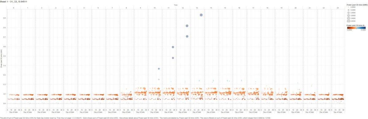
Let’s take a look at my energy usage over the course of a day, starting at midnight. You can see that by 8am, I’m just beginning to pull load from the outlet and continues throughout the day, usually past 7pm. This <below> is the result of my data collecting on my workstation alone over the past 5 months.
This is just one way to look at the visualization of this aggregate data. It’s taken quite a bit of effort to scrub the data and get all the information reading correctly, but in the future, we hope to optimize and automate this process. In fact, we’re almost there already.
This image below is the exact same data file. But now I’ve isolated where I’ve had spikes in energy use (those blue dots way above all the orange ones). I remembered that back in April, I did quite a bit of rendering on my computer. Those were most likely the cause of the spikes. So what you say? Well by isolating that data I can get a more exact cost of what those renderings truly took to get done. Now will we be nickel and diming our clients like this? Probably not. Its just there to show you the power of data and how it can be applied to real-world scenarios.